Xcode Previews lays out our views vertically. This style can be inconvenient when we want to preview a portrait screen on different devices or configurations and iterate on it while seeing our changes live.
For example, fitting four iPhone 12 previews on a 16” MacBook Pro requires we zoom out to 12,5%, making it difficult to see our elements. Unless you have a vertical monitor, you’ll usually be better off with side-by-side previews.
Visual Setup

Being able to display side-by-side previews means that we don’t need to scroll through multiple previews to confirm our changes didn’t introduce regressions on different color schemes or layout directions. The more previews you can fit, the less likely you are to overlook UI inconsistencies.
If you’re working on a single MacBook screen, you can use half of the Xcode window for code and half for previews and easily place eight previews without compromising zoom levels:
If you have an iPad, you can use it as a “Previews Monitor” by running Sidecar. You can duplicate your Xcode current tab by doing ⌘ + T and dragging the newly created tab over to the iPad. Once you have a duplicated tab, you can expand the previews section as much as possible on the iPad while hiding the previews section on your main screen.
In this post, we’ll go through what can and can’t be done when trying to simulate side-by-side previews.
⚠️ This is an example of how this feature could work. I don't advice relying on it for critical work. See the Downsides section to get more context on why this is not recommended.
SwiftUI Implementation
If you’re only interested in copying the code for this experiment, you can check out this gist.
First, we’ll need a Device type with the properties for each specific device. We’ll be passing these properties to our views .environment and .frame modifiers.
struct Device {
    let name: String
    let size: CGSize
    let horizontalSizeClass: UIUserInterfaceSizeClass
    let verticalSizeClass: UIUserInterfaceSizeClass
    let userInterfaceIdiom: UIUserInterfaceIdiom
    let orientation: UIInterfaceOrientation // We'll stick to .portrait for the moment
    let safeArea: UIEdgeInsets // Not considered at this point
    let displayScale: CGFloat

    static let iPhoneSE = Device(
        name: "iPhone SE (1st Gen)",
        size: CGSize(width: 320, height: 568),
        horizontalSizeClass: .compact,
        verticalSizeClass: .regular,
        userInterfaceIdiom: .phone,
        orientation: .portrait,
        safeArea: .init(top: 20, left: 0, bottom: 0, right: 0),
        displayScale: 2
    )

    static let iPhone12Pro = Device(
        name: "iPhone 12 Pro",
        size: CGSize(width: 390, height: 844),
        horizontalSizeClass: .compact,
        verticalSizeClass: .regular,
        userInterfaceIdiom: .phone,
        orientation: .portrait,
        safeArea: .init(top: 44, left: 0, bottom: 34, right: 0),
        displayScale: 3
    )

    static let iPadPro12_9 = Device(
        name: "iPad Pro 12.9-inch",
        size: CGSize(width: 1024, height: 1366),
        horizontalSizeClass: .regular,
        verticalSizeClass: .regular,
        userInterfaceIdiom: .pad,
        orientation: .portrait,
        safeArea: .init(top: 20, left: 0, bottom: 0, right: 0),
        displayScale: 2
    )
}
We can then define the combination of device and environment variables passed on to each preview element. For the moment we’ll only focus on \.colorScheme,\.sizeCategory, \.layoutDirection and \.locale but any environment variable could be added to this struct.
struct Preview {
    let device: Device
    let colorScheme: ColorScheme?
    let sizeCategory: ContentSizeCategory?
    let layoutDirection: LayoutDirection?
    let locale: Locale?
}
With our types in place, we can now dive into creating a layout that will render a view multiple times in an HStack.
struct Canvas<Content: View>: View {
  var content: Content
  var previews: [Preview]

  init(content: Content, previews: [Preview]) {
    self.content = content
    self.previews = previews
  }

  var body: some View {
    HStack(spacing: 32) {
      ForEach(0..<previews.count) { index in
        content
          // You can add any environment variable you need on this part after adding it to the Preview type.
          .ifLet(previews[index].colorScheme) {
            $0.environment(\.colorScheme, $1)
          }
          .ifLet(previews[index].sizeCategory) {
            $0.environment(\.sizeCategory, $1)
          }
          .ifLet(previews[index].layoutDirection) {
            $0.environment(\.layoutDirection, $1)
          }
          .ifLet(previews[index].locale) {
            $0.environment(\.locale, $1)
          }
          .environment(\.horizontalSizeClass, previews[index].device.horizontalSizeClass)
          .environment(\.verticalSizeClass, previews[index].device.verticalSizeClass)
          .environment(\.displayScale, previews[index].device.displayScale)
          .frame(width: previews[index].device.size.width, height: previews[index].device.size.height)
      }
    }
    .previewLayout(.sizeThatFits)
  }
}
The ifLet implementation will help us avoid overriding the default values when a environment variable is not set.
Now all we need to do is to pass the view to be previewed multiple times and the devices + configurations we want to display:
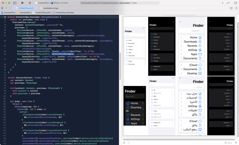
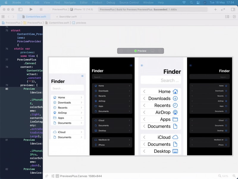
struct ContentView_Previews: PreviewProvider {
  static var previews: some View {
    Canvas(
      content: ContentView(text: .constant("")),
      previews: [
        Preview(device: .iPhoneSE, colorScheme: .light, contentSizeCategory: .extraExtraExtraLarge),
        Preview(device: .iPhone12Pro, colorScheme: .dark),
        Preview(device: .iPhone12Pro, colorScheme: .dark, contentSizeCategory: .extraSmall, locale: Locale(identifier: "ja_JA")),
        Preview(device: .iPadPro12_9, contentSizeCategory: .accessibilityExtraLarge, layoutDirection: .rightToLeft),
      ]
    )
  }
}
Extra Benefits
Apart from being space-efficient, this method provides a few other benefits over individual previews.
We don’t need to boot multiple different simulators. If you use previews with various simulators, you probably saw an activity indicator while the simulators are booting. With this approach, we can use a single simulator to mimic the other layouts.
You can “run” multiple views at the same time. If you click the Previews run button, your views will become active, and you can interact with them. Keep in mind that when in “run” mode, the preview takes the size of the simulator, so you’d need to use an iPad simulator and a ScrollView to see multiple previews.
This approach can be helpful when testing animations/transitions without pausing and running in the other simulators. It also works great for testing data-driven state changes. Your view gets copied multiple times, and any change to a store class that is bind to your view would trigger an update on all previews displayed.
Downsides
There are multiple downsides to this approach:
- I’m still learning SwiftUI, so my assumptions that a different device is replicated correctly via environment values can be way off.
- We can’t pass
safeAreavalues as an environment value. So the simulated previews will fail in that aspect. There might be ways to do it with a container view andGeometryReader, but that’s beyond this experiment. - OS-specific styles such as iPad sidebar navigation layout won’t work.
- The multiple
ifLetstatements made autocomplete struggle. Editing an environment value caused syntax highlight and autocomplete to break, which can be inconvenient when working on your personalisedCanvasstructure.